Why rounded corners dominate UI design (and when I keep one sharp)
Rounded corners are the default now, for a few good reasons and several overstated ones. What the research actually shows, the nesting rule Apple and Google both publish, and why the most interesting corner on a page is the sharp one.
Rounded corners dominate UI design for three reasons. People reliably, if modestly, prefer curved shapes. CSS made them free in 2011, after a decade of image hacks. And phone screens went round, so interfaces followed, and Apple now shapes its controls to match the device's corners. Claims that they cut cognitive load or lift clicks do not hold up.
Nearly every site I have shipped in the last few years is built out of rounded rectangles, this one included. A lot of what gets written about why cites nothing, so I read the studies and went through my own CSS. I found a mistake of my own on the way.
What does the research say about rounded corners?
The study everyone is paraphrasing is from 2006. Moshe Bar and Maital Neta showed 14 people pictures of objects, mostly everyday ones, for 84 milliseconds each, in curved and sharp-angled versions, and asked for a gut “like” or “dislike”. The curved versions were liked 67% of the time and the sharp ones 51% (Psychological Science). My favourite detail is buried in the method: 23 of the pairs were single letters, set in Arial against Arial Rounded MT, and the rounded letters won too. They were also slightly thicker, which the authors admit.
A 2007 follow-up scanned 16 people and found more activity in the amygdala, a region involved in fear and arousal, for the sharp objects (Neuropsychologia). The authors suggested sharp contours might read as a faint threat, which is where “your brain sees sharp corners as danger” comes from. It is still a hypothesis, and later experiments found curves pull people in more than angles push them away.
The best summary is a 2022 meta-analysis of 61 studies. The preference held up across them without being universal: a modest effect (Hedges' g = 0.39), strongest for quick glances by non-experts. For people trained in design, art or architecture it was small and not significant. So was the effect on logos and typefaces.
Two popular claims do not survive the sources:
- “Rounded corners reduce cognitive load.” The 2006 study timed its participants. They answered in 595 milliseconds for curved objects and 600 for sharp ones. I could not find a single study that measures cognitive load for rounded versus square interface elements.
- “Rounded buttons get more clicks.” A 2023 paper reported a 55% lift from rounded ad elements. The A/B test behind that number had 919 visits. In 2026 Ronny Kohavi, Andrew Gelman, Guido Imbens and colleagues tested the idea on 7.1 million users: a 0.21% lift, not statistically significant.
So people like curves a little. It is a real reason, just not a big one.
Why did everything go round at the same time?
Mostly because it got cheap. In May 1981 Steve Jobs asked Bill Atkinson to add rounded rectangles to the graphics library that became QuickDraw. When Atkinson said it was hard and unnecessary, Jobs took him for a walk, pointing out rounded rectangles in the room and then outside it, until a No Parking sign settled the argument. By the following afternoon Atkinson had them drawing almost as fast as plain rectangles.
The web took longer. border-radius was first drafted in November 2002, but it only worked without a prefix in every major browser in March 2011, when IE9 and Firefox 4 shipped eight days apart. Before that, a rounded box that worked everywhere, Internet Explorer included, meant corner images sliced into table cells or stacked in nested divs. Once it cost one line of CSS, nobody had a reason not to.
Then the hardware went round too. The iPhone X ran its display into the phone's rounded corners in 2017, and Apple told developers to keep controls inside a Safe Area so the corners would not clip them. When Apple introduced Liquid Glass in June 2025, it went further and redrew its controls to sit concentric with the corners of the device. Windows 11 went round in 2021 on screens that are still square, with 8px windows around 4px buttons, aiming, Microsoft says, for something softer and calmer.
How I use rounded corners on samuelnbr.com
On this site, the radius depends on what the thing is:
- Things you press are pills. Every text button uses
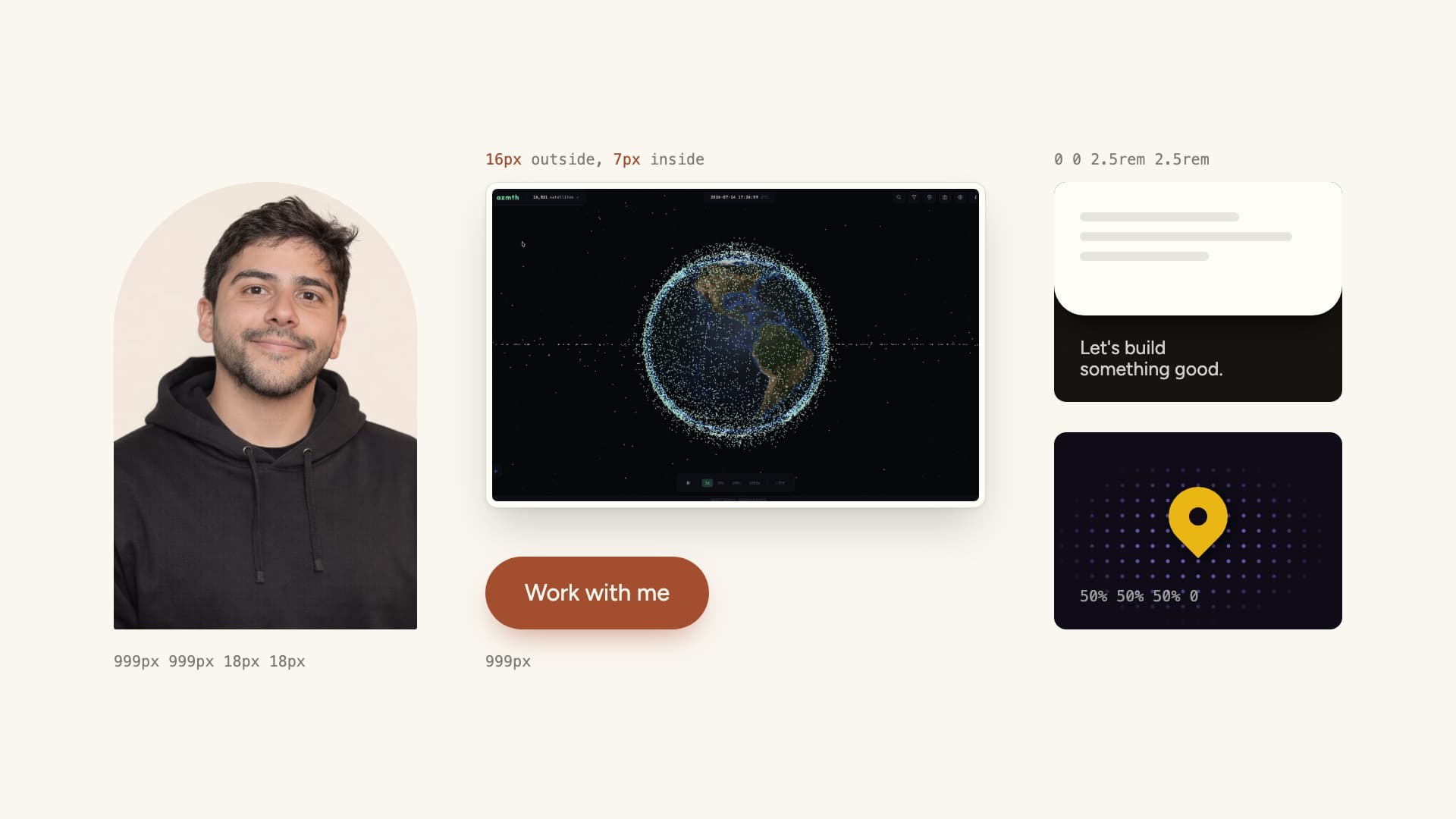
border-radius: 999px. Not50%, which turns a wide button into an ellipse because the horizontal radius is half the width. A huge length works because browsers scale all the radii down by the same factor until they fit, which on a button lands on exactly half the height. - My portrait sits in an arch,
999px 999px 18px 18px: fully round at the top like a window, nearly square at the bottom where it sits on the page. That same scaling shrinks the 18px corners to about 3px on a laptop screen, which I only found out while writing this. - The page itself is a sheet rounded only at the bottom,
0 0 2.5rem 2.5rem. Scroll to the end and it lifts off the footer like a curtain. With four rounded corners it would just be another box. - Screenshots sit in frames, like the azmth one in the cover and every project in my work: a 16px outer corner, with a faint ring drawn 8px inside it at 7px. Those numbers are not arbitrary, which brings me to the only rule on this page worth memorising.
What is the nested border radius formula?
When one rounded shape sits inside another, the inner radius should equal the outer radius minus the gap between them. Both curves then share a centre and the gap stays even all the way round. Apple's design system says concentric shapes “calculate their radius by subtracting padding from the parent's”. Material 3 publishes the same formula, with 48dp minus 14dp of padding giving 34dp.
Give both boxes the same radius instead and the gap at each corner comes out about 41% thicker than along the sides (it is the square root of two, if you want the geometry). The more padding you add, the worse it looks. Try it:
I checked my own frames while writing this. The ring sat 9px inside the edge, a 1px border plus 8px, with a 7px corner, but the outer corner was 12px, so the band between them came out about 18% thicker at the corners than along the sides. Nobody was ever going to notice. I noticed. The outer corner is 16px now.
CSS has no keyword for this yet. A proposal for a matching-radius value has been open since 2022, so for now it is a variable and some arithmetic:
.card {
  --radius: 24px;
  --pad: 8px;
  border-radius: var(--radius);
  padding: var(--pad);
}
.card img {
  border-radius: max(0px, var(--radius) - var(--pad));
}
When should you use sharp corners?
Neither is better in general. Round what people press and what sits on a rounded screen. Keep a corner sharp when it is joined to something, pointing at something, or packed with data.
Once everything is round, a sharp corner stands out, and that is worth using. Windows 11 is the most explicit about it. It does not round a window that is maximised or snapped to the edge of the screen, and straight edges that meet other straight edges stay square. In that system, a square corner means this is joined to that.
The clearest example I have built is a map pin. On the Czarna Owca site, which I made for a Warsaw media house, gold pins mark where the agency runs campaigns. The shape of each one is two lines of CSS:
50%50% 50% 50% 0rotate(-45deg)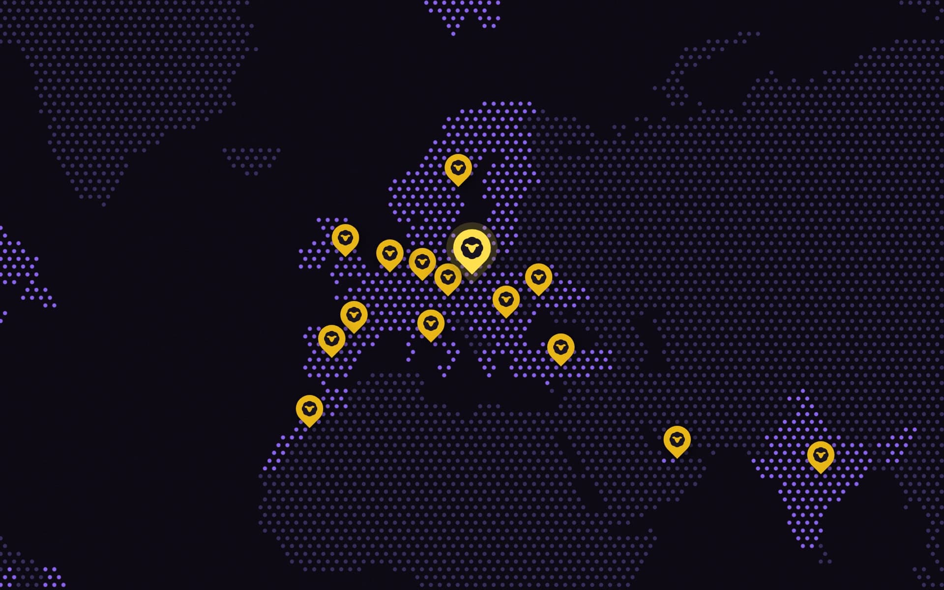
Speech bubbles work the same way: the one corner that is not rounded tells you who is talking. Dense tables and dashboards are the other obvious case, where rounding every cell costs space and blurs the grid. Even Google has come round to it. The guidance for Material's newest style, Material 3 Expressive, now recommends mixing sharp shapes in to add tension.
Can you use squircles in CSS yet?
Nearly. A squircle sits between a square and a circle, and the new corner-shape property can finally draw one. It changes the curve inside a radius you have already set: round is the default, and the others are squircle, square, bevel, scoop and notch, plus a superellipse() function for anything in between.
corner-shape shipped in Chrome 139 on 5 August 2025. As of September 2026, Safari only has it in Technology Preview and Firefox only in Nightly, so do not depend on it yet. It is safe to add, though, because browsers that do not know it ignore it and draw ordinary round corners:
.card {
  border-radius: 24px;
}
@supports (corner-shape: squircle) {
  .card {
    /* a squircle looks less round at the same radius */
    border-radius: 32px;
    corner-shape: squircle;
  }
}
One thing the CSS squircle is not: Apple's icon shape. In CSS it is exactly superellipse(2), and Apple's curve turned out not to be a superellipse at all.
Rounded corners, quickly
Are rounded corners better for UX?
Slightly, and only sometimes. People prefer curved shapes at a glance, but I could not find a study showing rounded interface elements are faster to use, and A/B tests on 7.1 million users found no statistically significant lift in clicks. Round corners to fit the hardware and keep a system consistent, not to raise conversion.
How do you calculate the inner border radius?
Inner radius = outer radius minus the padding between the two boxes. A card with a 24px radius and 8px of padding wants a 16px radius on the image inside it. If the padding is bigger than the outer radius, the formula bottoms out at zero and the inner corner goes square.
What is the best border radius for buttons?
Pick one style and use it everywhere. Material 3 buttons default to fully round, while Windows 11 uses 4px on its controls. For a pill, use a large length such as 999px rather than 50%, which turns a wide button into an ellipse.
What is the best border radius for cards?
There is no correct number, only a consistent scale. Material 3 offers 0, 4, 8, 12, 16, 20, 28, 32 and 48dp plus fully round, and Windows 11 puts 8px windows around 4px controls. Pick a few steps, give bigger containers the bigger radius, and work out anything nested with outer radius minus padding.
One more thing
Apart from the map pins, there is one corner on this page that is not rounded, and it is not pointing at anything. You scrolled past it at the very top. Go back up and click it. Click it again, or press Esc, to get the curves back.