What a restaurant website actually needs (and what it doesn't)
I built the sites for two Warsaw restaurants from the same group. Almost everyone who lands on one arrives with the same three questions, and most restaurant websites bury all three. Here is the list I hold a build against.
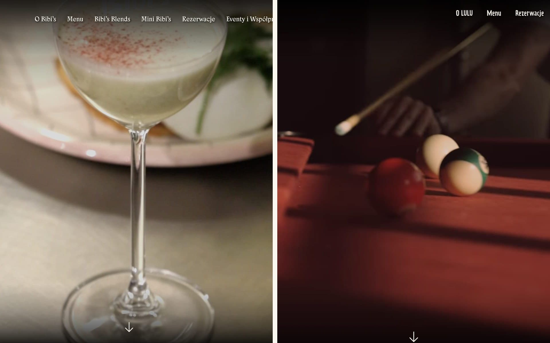
I have built websites for two restaurants in the same Warsaw group, and the brief both times started in roughly the same place: we want it on WordPress, and we want it to feel like us.
Both are reasonable things to ask for. The thing we usually get to later is what the site is there to do in the first place, and most of the time the honest answer is quite small. It answers a few questions for someone standing on a pavement with one bar of signal, deciding where to eat in the next ten minutes.
Almost everyone arrives with one of three questions
Are you open. Where are you. What is the food like.
That is most of your traffic, right there. The founding story, the sourcing philosophy, the very beautiful full-bleed video: all of it can exist, and on a good site it does. It just gets looked at after those three, by the small number of people who are still reading.
Both Bibi's and LULU put the hours, the address and a link for actually getting there on the homepage, rather than two clicks away behind a contact page. It is the least glamorous work in the whole build. It also does more for the restaurant than anything else on the screen.
Steal the questions your staff already answer
Both sites have a short Q&A near the bottom, and the questions in it were not invented in a workshop. They are the ones the team answers on the phone every single day. Can we come without a reservation. Do you take reservations. Where exactly are you. How do I get there. I am vegetarian, is there anything for me. We want to hold an event, who do we talk to.
If you want to know what belongs on a restaurant website, stand next to the host stand for an afternoon and write down every question you hear twice. That list is your sitemap.
It also happens to be the format search engines and AI assistants like to quote back at people, since it is a plain question with a plain answer sitting under it. Nice side effect. The reason to do it is that someone genuinely wants to know whether they can turn up at eight on a Friday without booking.
The menu is the website
If someone only ever sees one page, it is the menu. It should be a real web page: fast, readable on a phone without pinching, and current.
I believe that enough that I built both sites with proper menu pages. Today, if you click Menu on either one, you get a PDF.
That changed after I handed the sites over, and I think the client was being entirely rational. The kitchen changes the menu often. The same file already goes to the printer for the physical menus. So once the site is yours, exporting one PDF and pointing the link at it is a minute of work, and editing structured menu pages is more than a minute. Every time. Multiply that by a year of menu changes and the PDF wins on arithmetic alone.
The pages themselves were fine. Keeping them current was the chore, and the chore is what decided it. That is probably the most useful thing either of these jobs taught me. Whatever you build has to also be the path of least resistance, because the day you hand over the keys, whichever option takes less effort is the one that survives. Hard to argue with someone for picking the quicker route during a lunch rush.
Nagging people into updating pages was never going to work. Making the update cheap might have: one field to change a dish and a price, or better, building the page off the same file that goes to the printer, so the two cannot drift apart in the first place. A menu that costs the kitchen nothing to keep accurate is the only kind that stays accurate.
It has to sound like the restaurant
This is the part clients mean when they say "it should feel like us", and it is worth taking literally.
Bibi's and LULU belong to the same group, and underneath they are near enough the same website. Same CMS, same page structure, same set of things a manager can go in and change. All of that is plumbing, and plumbing should be boring and repeatable.
What sits on top of it has almost nothing in common, which was the whole point of doing two builds instead of one.
Bibi's is an Australian-inspired all-day cafe: cream and sage, hand-drawn lettering, a lot of daylight, food shot like it is good for you because it is. The name was inspired by the owner's mother, as the restaurant explains on its own site, and the whole thing leans warm because of it. LULU is a modern diner and bar that turns into something else after dark, so the site is dim and cinematic, the copy is loud and a bit rude, and it openly tells you that after six in the evening there is no room for small talk, only for gossip.
Swap the two designs over and anyone who has actually been to either place would feel that something was off, before reading a word.
A template gets you a site that works, and that is worth real money when the budget is what it is. What it will not get you is a room. People pick a restaurant the way they pick a bar or a friend to sit with, mostly on atmosphere, and atmosphere is a large part of what a restaurant is selling in the first place.
Why WordPress was the right call
Both clients asked for WordPress. Left alone I would have reached for something else, and I am glad they insisted, because the constraint was correct.
The people who update a restaurant website are not developers. They are a manager adding next month's event, or swapping the menu after the kitchen changes it, or publishing this month's Bibi's Blends, the series where a guest creates a smoothie and twenty percent of what it earns goes to a charity they pick. That has been running monthly for over a year, with a long list of collaborators behind it.
If publishing any of that requires emailing me, it quietly stops happening. Then the site rots, and a rotting site is worse than a plain one, because now your hours are wrong and someone drove across town. The best CMS for a restaurant is whichever one a busy manager will actually open on a Tuesday.
Let Instagram do the heavy lifting
Restaurants already publish constantly. They just do it on Instagram. The new dish, the guest bartender, the aperitivo hours, tonight's event, the thing that came out of the kitchen looking especially good: it goes up there, because that is where the regulars are and because posting takes about thirty seconds between services.
A website is never going to keep that pace. Nobody is going to open the CMS at eleven at night to write up a special that sold out anyway. So both sites pull the Instagram feed straight onto the homepage, and the problem solves itself: the page has something new on it every couple of days, and the restaurant did not have to lift a finger beyond what it was already doing.
That matters more than it sounds, because a stale website quietly makes a place look shut. An events page whose last entry was eighteen months ago, a news section frozen mid-2024, and a visitor starts wondering whether you are still open at all. A feed with a post from Tuesday on it says the lights are on, without anyone writing a word for the website itself.
It is the same lesson as the menu, from the happy end. The version that costs the restaurant nothing is the version that keeps working after everyone stops paying attention to it.
And what they do not need
- A custom reservation system. Use the booking tool the restaurant already runs on. Guests trust the flow they have seen before, and the staff already know the dashboard. Building your own here is spending real money to make something slightly worse.
- A blog, usually. Unless something real is driving it, like Bibi's Blends, you get three posts from the launch month and then nothing. A blog with a cobweb on it reads worse than no blog at all.
- An app. Nobody is installing an app for one restaurant.
- Audio that starts on its own. Somehow this still happens.
- A splash screen or a long intro animation. The person checking whether you are open right now does not want to be held for four seconds first.
- Sixty photos from 2019. A dozen honest current ones beat a gallery nobody scrolls, and they load faster.
The short version
If you are building or commissioning a restaurant website, this is the list I would hold it against:
- Opening hours on the homepage, and correct
- Address, plus a link that actually gets someone there
- The menu as a fast web page, kept current
- Reservations in one tap, through the system you already use
- A phone number that dials when tapped on a phone
- Real photographs of the real room and the real food
- Plain answers to the questions your staff repeat all day
- Quick on a phone, on mobile data, outside
- Updatable by someone who has never opened a code editor
- And it should sound like nowhere else
Everything past that list is craft, and craft is the part I enjoy most. It cannot rescue a site that buries the basics, though. A beautiful website that hides the opening hours is a beautiful website that sent someone to the place across the road.
If you run a restaurant and your site is not doing these things, tell me about it. It is usually a smaller job than people expect, and there is more of what I have built if you want to see the rest first.